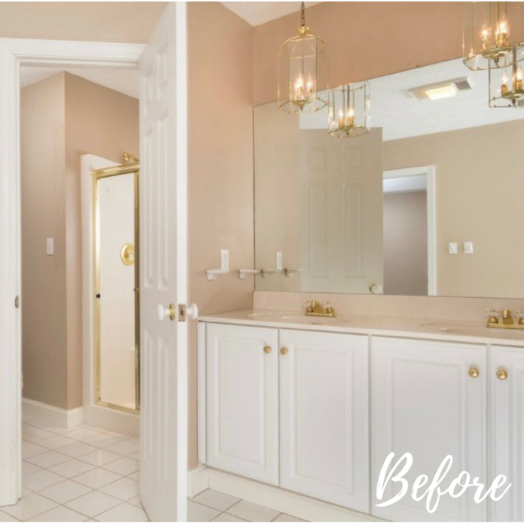
When it comes to bathroom remodels, before and after pictures are clear evidence of just how much can be accomplished in a small space. Not so sure? Check out one of our more recent projects in Hurricane. Even our designers were stunned.
Our clients had recently moved to the area from North Carolina and were ready to do some upgrading to their new home. The first project on their list was their bathroom for many reasons:
- The finishes were out of date
- The shower was too small for the husband to fit into easily
- The bathtub took up too much of the space and was hard to clean
- The clients preferred a more eclectic design that reflected their personalities
When we saw the bathroom for the first time, we understood why they wanted a change. Although the finishes were white and neutral, the room felt out of date due to the flatness of the tile finish. And it was void of any personality.
Although we at Yeager Design often use touches of gold in our designs, this was more of a blush and brass color palette that needed an update from its ’90s roots. The clients preferred a warmer color palette in everything from the wall color to the natural wood finishes.
A spa blue was used on the walls to create a relaxing yet colorful accent for the space. The cabinetry was knotty alder wood with a cappuccino stain that let the personality of the wood shine through the medium-toned stain. Champagne-bronze hardware was used to finish off the cabinetry and create bits of glowing metallics that elevated the design.
To incorporate a wood-like appearance on the floor, we chose to install ceramic tile in a gray wood pattern. This perfectly accented the faux marble tile that surrounded the tub area and quartz countertops.
Perhaps my favorite finish of this space is the accent wall of tile behind the vanities. Our client knew that she wanted a “wow look” upon entering the bathroom, and this did the job. Our contract team installed a honeycomb mosaic wall that extended from the ceiling to the countertop, and to see it in person is breathtaking.
In a small separate area from the main vanity and tub was the water closet or vertical coffin, as we fondly called it … the shower. The brass door insert was so low our clients had to turn sideways and duck to enter the shower. Once inside the coffin/insert, bathing in the small space was a chore.
Obviously, our goal was to enlarge the space as much as possible. Because the original install was an insert, there was about 18 inches of wasted dry wall space to be gained. We knocked out as much drywall as possible, then installed large-scale bright white and gray tile to make the space feel airy and grand. We also carried the honeycomb design from the vanity area on to the back wall of the new shower design for a point of interest and flair.
Again, champagne-bronze fixtures and finishes were used to carry the metallic scheme into the shower. The door we chose to finish the shower with was a clear glass, frameless installation that makes it appear as if there is no door at all. This not only creates ease for the end user but is a classic timeless design that will never go out of style, compared to the beveled glass and brass combination we replaced.
When designing a bathroom renovation for our clients, they often want to remove the bathtub from their design for spatial constraint purposes. This was not the case in this project. In order to update the space and still include a large enough tub to be useful and scale-appropriate, we decided to go a with a free-standing tub that would be less visually blocking. By getting rid of the built-in surround, the new tub area design appears more open, airy and relaxing.
The finishing touches of a bathroom renovation can absolutely make or break a design. Our clients chose abstract art, eclectic light fixtures and meaningful touches to complete their bathroom.
The personal spaces in your home should reflect your personality and make you feel comfortable, relaxed, and generally “at home.” Following trends is a good thing, as long as you stay true to yourself and your tastes while making your spaces able to stand the test of time. You don’t want to make things so personal that you would have a hard time selling your home when you eventually move on to another phase in life.
Some ways to achieve this are:
- Consider classic elements when choosing tile, paint and flooring. These are the harder furnishings and finishes to change out when you grow tired of them.
- Personal and eclectic touches are easier to achieve in your wall hangings, light fixtures and soft goods, like towels and rugs.
- Be sure to partner with a trusted and reliable designer/contract team that can guide you to make solid decisions and take the guesswork out of project management.
As always Yeager Design & Interiors is thrilled to give you an inside look into our design world. We love sharing our before and after projects to show just how easily you, too, can take a space from outdated to now and wow. Stay tuned for our next installment!
Elizabeth Yeager Cross is the owner of Yeager Design & Interiors in Scott Depot. You can follow YDI on Facebook, and Yeager Cross can be reached at 304-760-8914 or by email at Yeager@ydiwv.com. Have a design challenge? Find out what our area experts have to say! Send your questions — even photos — and a summary of what you’d like help with, along with your contact information, to social@wvgazettemail.com. The solution to your design challenge could be featured in a future WV Design Team article.