By Elizabeth Yeager Cross WV Design Team
In the summer of 2018, Jennifer and “Flip” Marsh came to Yeager Design & Interiors with their forever home project in Hurricane.
Together, they have four children ranging from elementary to high school age, and they were building a home that would suit all of their family’s entertainment and everyday needs. Their custom home was built with Steorts Home Design and Construction, who specialize in design builds. They worked hand in hand to create a custom floor plan that met their family’s needs and ended up in a truly beautiful, detailed home.
The Marshes were in need of furniture and accessories that would help highlight their detailed architecture and make their home feel comfortable and livable, yet design centered. The fabrics needed to be durable for pet and kid use, and they enjoyed the look of rustic chic wood and leather finishes. Armed with this information, Yeager Design & Interiors set out to help them space plan and carefully select each item that would fill their main living areas.
The first area on our check list was the front door/foyer. This space sets the first impression for all guests who enter their home.
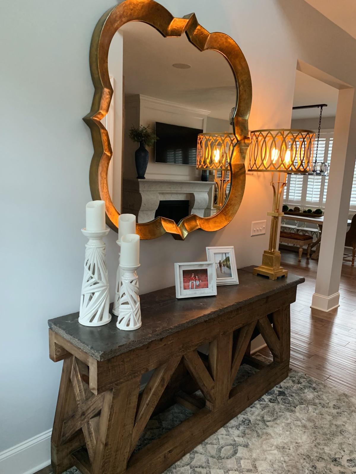
We chose a 7-foot-long hand-hewn trestle-based table with a live edge bluestone top to act as an anchor for this double-height lofty entry. Like YDI, Jennifer loves a pop of gold metallic against gray and white, so we paired it with a quatrefoil gold hammered metal mirror. This stunning piece is large enough to fill the double height entry wall while creating a glamorous effect.
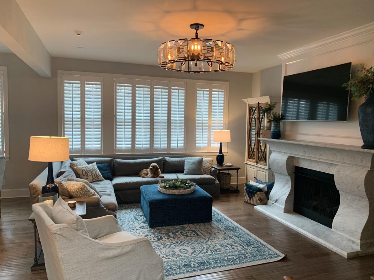
As you walk farther into the home, you enter the open-floor-plan family room and adjacent kitchen and dining areas. We chose a low-profile Sunbrella fabric sectional, which acts as a space divider but is not a visual hindrance in the space plan.
The sectional’s gray woven fabric serves as a medium-tone neutral that lets Jennifer change her decor and colors out seasonally. For our design though, we chose hues of navy, cobalt, turquoise and aqua to add pops of color throughout the first-floor space. From the rug to the custom storage ottoman to the patterned pillows, these accessories give the rooms a more and vibrant feel.
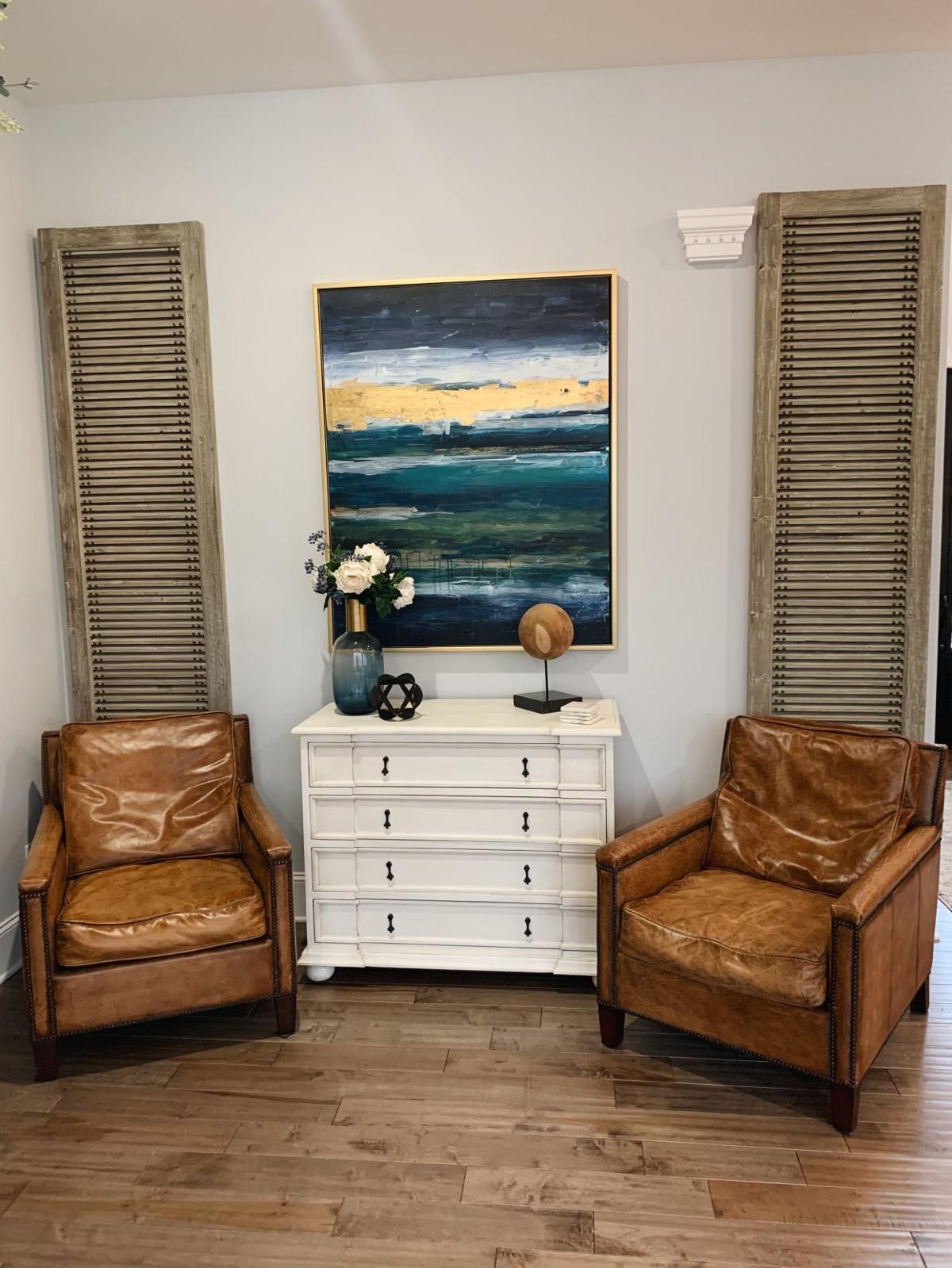
Opposite of the sectional, we created a wall-enveloping design by using two pine louvered shutters that draw the eye upward, paired with two antique worn leather chairs. In the center of all this, we installed an interestingly carved chest of drawers with a drop dead gorgeous abstract colorful piece of wall art. This area gives the room character and interest with its varied materials and finishes while pulling it all together with the downstairs color scheme.
Jennifer said most people who visit the house say their favorite pieces are the sectional, for its sleek appearance and comfort, as well as the two-toned Greyson storage cabinet that sits to the left of the fireplace. This piece displays some of their accessories, such as precious family clocks and items that are meaningful to the family.
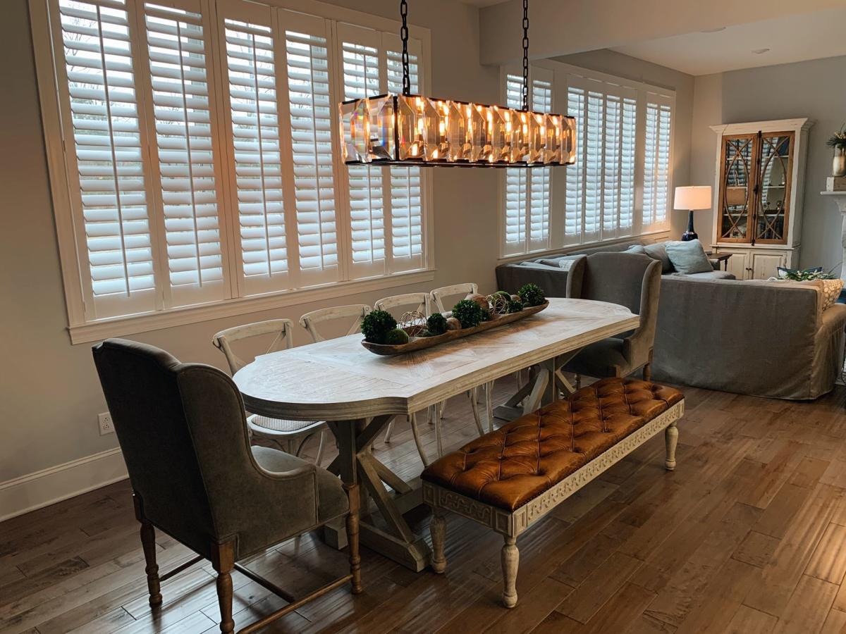
Next to the family room are the dining area and eat-in kitchen. The challenge in this area for YDI was to find a table large enough to seat 10 to 12 and to be able to withstand the daily use of a large family, while looking great at the same time.
We chose a unique, trestle-based table with parquet inlaid top and paired it with white-washed X-back chairs, gray velvet captains and a long, tufted-leather bench. This gave flexibility for seating options, while still appearing beautiful and functional.
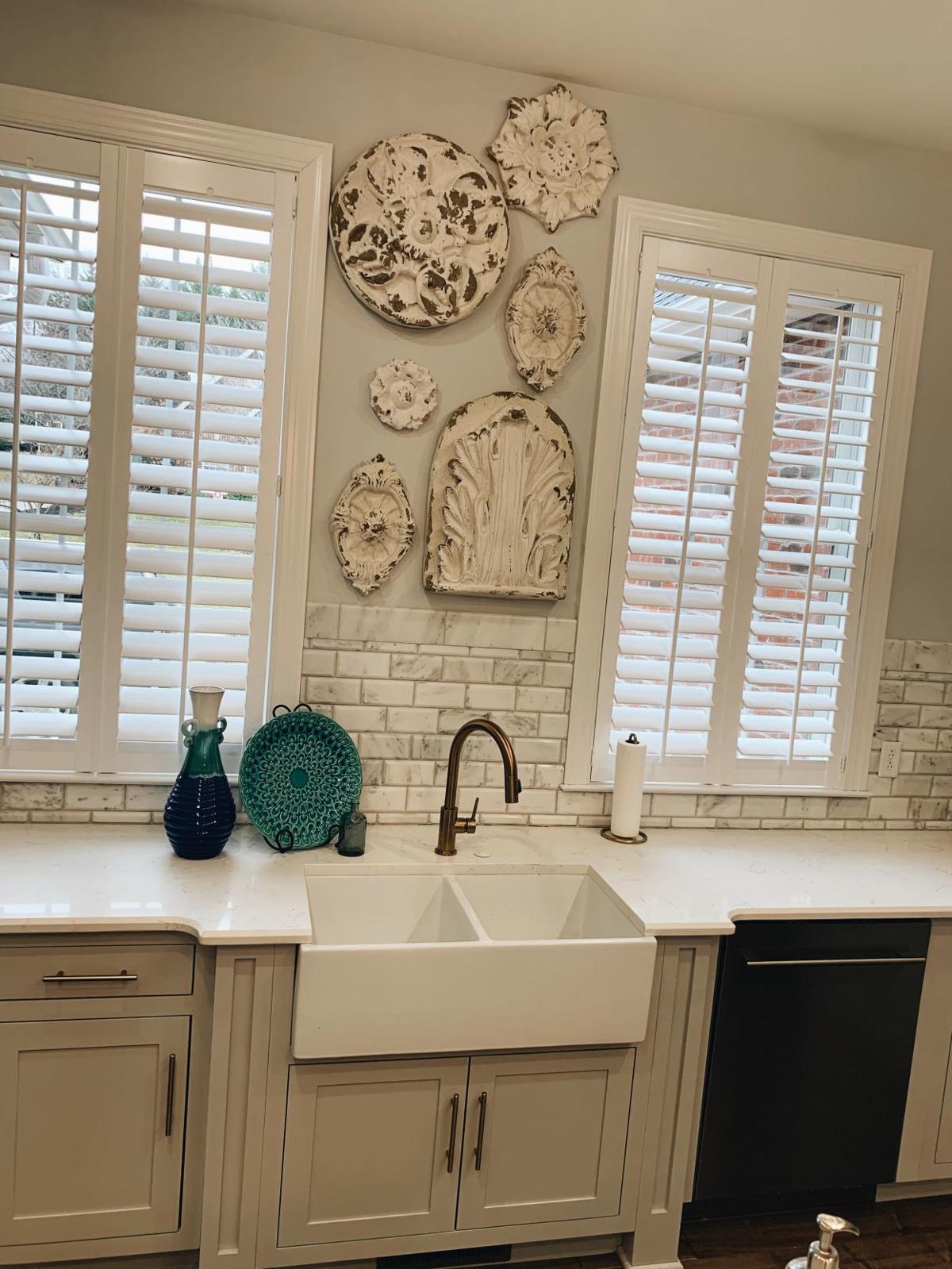
In the kitchen, there are two feature windows on the back wall that left a small void in wall space. YDI chose to install some vintage-inspired white-carved relief pieces that would beautifully complement the white, gray and gold kitchen design by Steort.
The last space to feature in today’s article is quite possible our favorite.
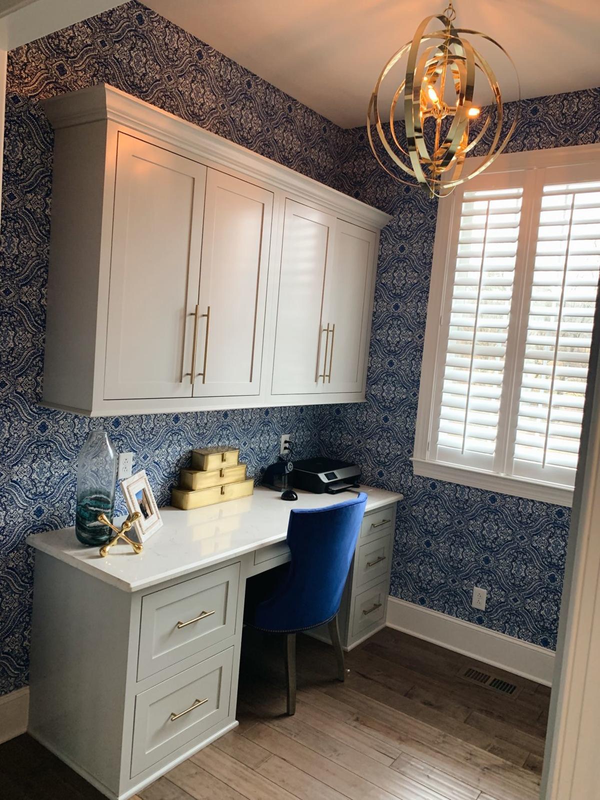
Jennifer wanted an office that was all her own, off from the kitchen where she could manage and run her family’s schedules and lives. The contractor provided her with beautiful and adequate storage, while YDI helped to bring her vision to life. We installed a vivid blue and white wallpaper print, and then accented the space with a bright gold orb chandelier; a custom blue velvet desk chair; and cobalt, white and gold desk accessories that make it a glamorous and fun spot to get work done.
Recently, I asked Jennifer what it was like working with a design team during building a home and being in the moving process. She commented that because it is such a stressful time in her life — making so many decisions at one time — it was fabulous to have a team that made things easier for her, so she didn’t have to run around and find things.
The work was done for her, so that all she had to do was point out the things she loved. Everything was moved into the home after all selections had been made, so it was quickly livable in all the main areas — making moving a breeze.
From a design standpoint, our best advice when building is to work with a contractor and designer you click with, much like the Marshes did with Steorts and YDI. Customizations to your plans, ease of decision making and guided project management are the keys to a successful new build, and working with professionals is the way to achieve that.
For more information and to see breathtaking photos of the Marsh home (including the custom marble hood and fireplace installed by Steorts), please visit yeagerdesignandinteriors.com. We look forward to sharing more about the beautiful Marsh home in the coming months.
