By Elizabeth Yeager Cross
WV Design Team
As anyone who has a pulse recently has seen, gray is the new black!
It has been a recurrent design color from kitchens and living areas to even the private spaces of homes such as bedrooms and baths. We at Yeager Design and Interiors thought we would share one of our most recent before-and-after remodels.
This project is one of the most dramatic due to the fact that it was such a small space and ended up being a total gut of the room. Our clients, the Bevers, were unhappy with the current bathroom because of several key features:
• Garden (corner) tub
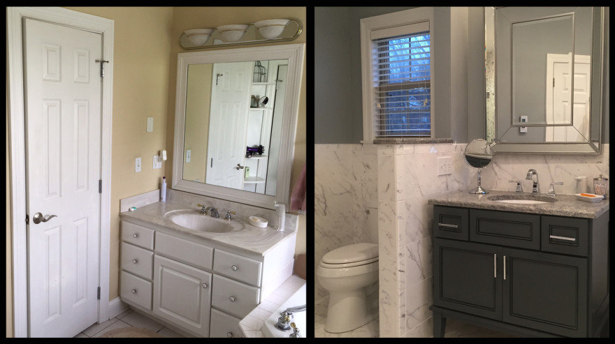
• Outdated fixtures and colors
• Disconnected feeling
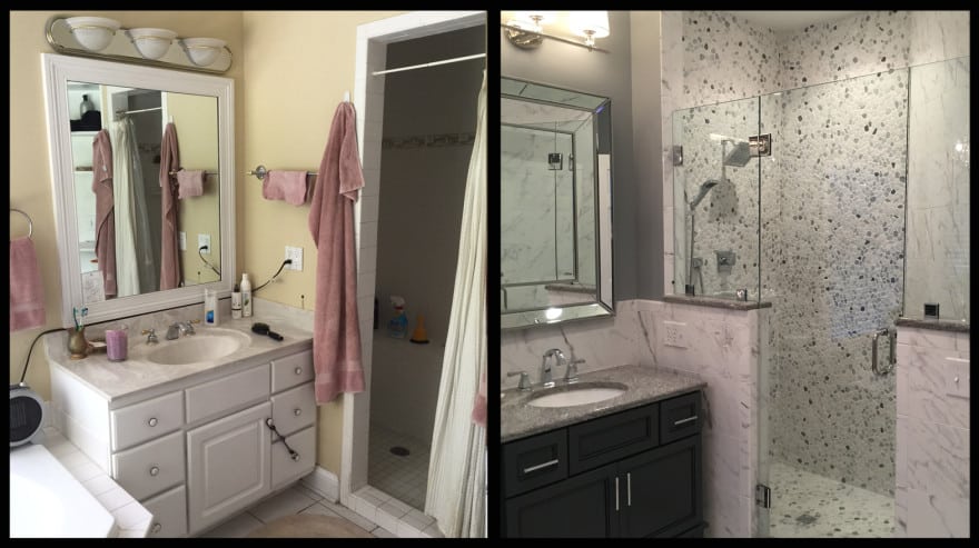
• Cramped shower with curtain only option
The Bevers knew that they wanted drastic changes, and through the course of five or six consultations, a plan of action was drafted and approved.
We discussed at length, first and foremost the budget they had in mind, as well as the logistics of the new design and the look they were going for, which — as you might suspect — included gray.
After scouring our vendors for the perfect tile, vanity cabinets, and plumbing fixtures, the YDI team put together what would become one of the most stunning transformations we had ever done.
We addressed the eye sore of the room first, the corner garden tub. By removing this feature, the bulk of the room was opened and space was freed for slightly larger vanities. In its place, we chose an elegant freestanding soaking tub.
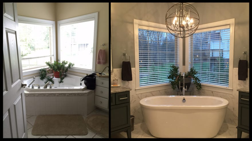
The garden tub (left) was the first thing to go, creating additional space and an airy, light feel with the addition of a free-standing tub in its place
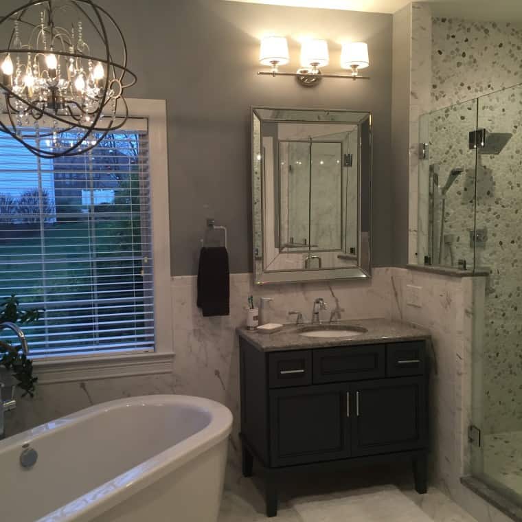
The new vanities were furniture pieces on tall legs that — while dark in color — felt light and airy because of the openness underneath them. Instead of a standard counter top, we chose a sleek white-and-silver granite called Silver Cloud. Contemporary chrome fixtures and faucets were paired alongside beveled trim mirrors and chrome sconces with white shades.
To address the issues of a too-tiny shower and a disconnected feeling, we took a hard look at the walls in the room. The new design plan incorporated opening the existing walls for the water closet and shower. This not only gave the shower more square footage, but it also bathed the dark, cave-like room with natural sunlight.
The garden tub (left) was the first thing to go, creating additional space and an airy, light feel with the addition of a free-standing tub in its place
We chose to separate the toilet from the rest of the room by a single knee wall. After removing an oversized shower seat, gaining as much square footage as possible, we built two separate knee walls for the shower. Installing glass panels and a shower door in the middle, gave the illusion of an open shower plan.
Perhaps the most dramatic of all was the white-and-gray tile design scheme. Although more expensive for the sheer amount of tile and the labor to install it all, we felt that using large scale recycled ceramic tile in a white marble with gray vein design would by far create the most change for the space. We kept the tile on the wall the same height as the knee walls to ensure a smooth line of transition throughout the space.
The marble tile and half wall use gray undertones to create a neutral backdrop so the vanity and accent pieces can pop
The size of the tile was large enough to keep from looking busy when paired with large scale floor tile in the same marble finish.
To mix things up in the shower, the client found an incredibly gorgeous stone pebble tile insert. This provided a break in the marble design scheme and served as an accent wall in the clean master bathroom.
To finish out the space, layers of towels, washcloths and rugs in varying shades from white to gray were placed to add touches of softness. The final touch of glamor, the pièce de résistance, was an orbed chandelier. It was installed over the tub area to bring all of the elements together in a luminous dramatic manner.
The overall design of the bathroom, upon first entrance, emotes feelings of luxury, relaxation, airiness, and lightness. The white-and-gray color scheme, while monochromatic, gives depth and interest through the combination of texture and sleek lines.
Our clients were thrilled with their new master bath retreat and were especially appreciative that it was put together for them without any fuss or hassle.
If you find yourself with an outdated bathroom consider working with a design team not only for choosing your finishes, but also for the added benefit of having someone provide skilled labor. In this instance, and almost all of YDI’s remodels, we chose to work with Anthony Harrah for his unparalleled installation perfection.
– To see more pictures of the projects featured in this article: Bever Bathroom
– To read the full article: http://www.wvgazettemail.com/article