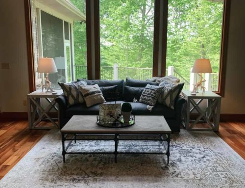
In the summer of 2018, Dr. Rose Ayoob and her wife, Patricia Rogers, were closing on their new home in The Ridges of South Charleston and moving back to the area after spending a few years in Columbus, Ohio. They were both excited to be coming back home — and as fellow West Virginians, we at Yeager Design & Interiors were excited to have two amazingly talented young professionals coming back to our community.
Rose is a pediatric nephrologist and Patricia is a craniosacral therapist. They needed our professional design services to help find furniture and finishing touches for their new home, especially while they were still in the moving transition and not yet living here full-time.
Through the course of the next few weeks and months, between phone calls, FaceTime calls and face-to-face meetings, we were able to put together a curated collection of hard and soft goods that would help make their new house a home and reflect them each, personally.
In today’s installment of the WV Design Team, we would like to feature their entry, dining room and office to share with you just how we focused on the details that made their entry an inviting and beautiful first impression.
Very commonly, house plans include a front entry setup that directs guests forward to the family room or left and right to a dining and formal living space. This house was no exception. As you enter the home through Rose and Patricia’s front door, to the immediate left is a nice-sized hardwood room. Rose wanted it to be designed as her home office.
On the opposite side of the door is what would be the dining room. Just past each of these is a very small wall that we would deem worthy of our entry hall table and mirror design.
Since you could see each of these spaces all at once, they needed to be complementary of each other. We achieved this by choosing our color palette that included whites, grays, wood tones and metallic hints.
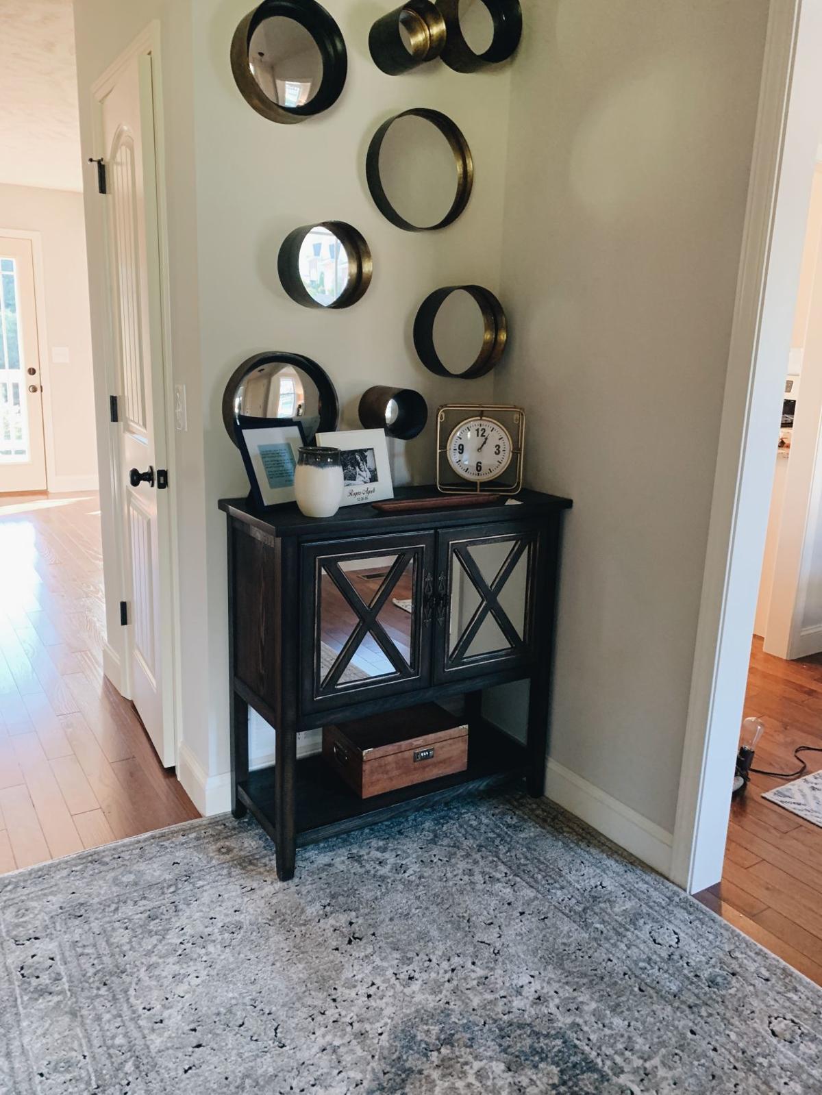
The entry table was a dark wood and mirror cabinet. While small, it gave the couple storage and a place to show pictures of loved ones. Our clients were so full of personality and were open to a more interesting and fun design approach, so we chose to install eight, multisized mirrors above the cabinet.
They not only filled the wall space but created interest. We also decided on a medium gray machine-made rug that would easily tie the open spaces together and take abuse and wear from all who entered the front door.
The dining room turned out to be one of my favorite spaces in the couple’s home. They brought an antique dining table that had been passed down from Patricia’s great-grandfather all the way to her, as well as a small, hand-crafted liquor cabinet that Patricia’s father had made for her. These items were beautiful and sentimental and would be the foundation of the design for the room.
To keep the room casual, light and airy, we decided that any other finishes would need to be a mixture of fabrics and paint in lighter tones, such as whites, grays and creams. We layered in tufted linen captain chairs, a gray-and-white table runner with a gray, cream and beige area rug that softened the wood floors and pulled the room together.
The most beautiful piece in the room was a breakfront china cabinet with a glass and iron trellis design on each door. The piece held a vast collection of Patricia’s American Fostoria. It had been collected by her mother over the course of many years.
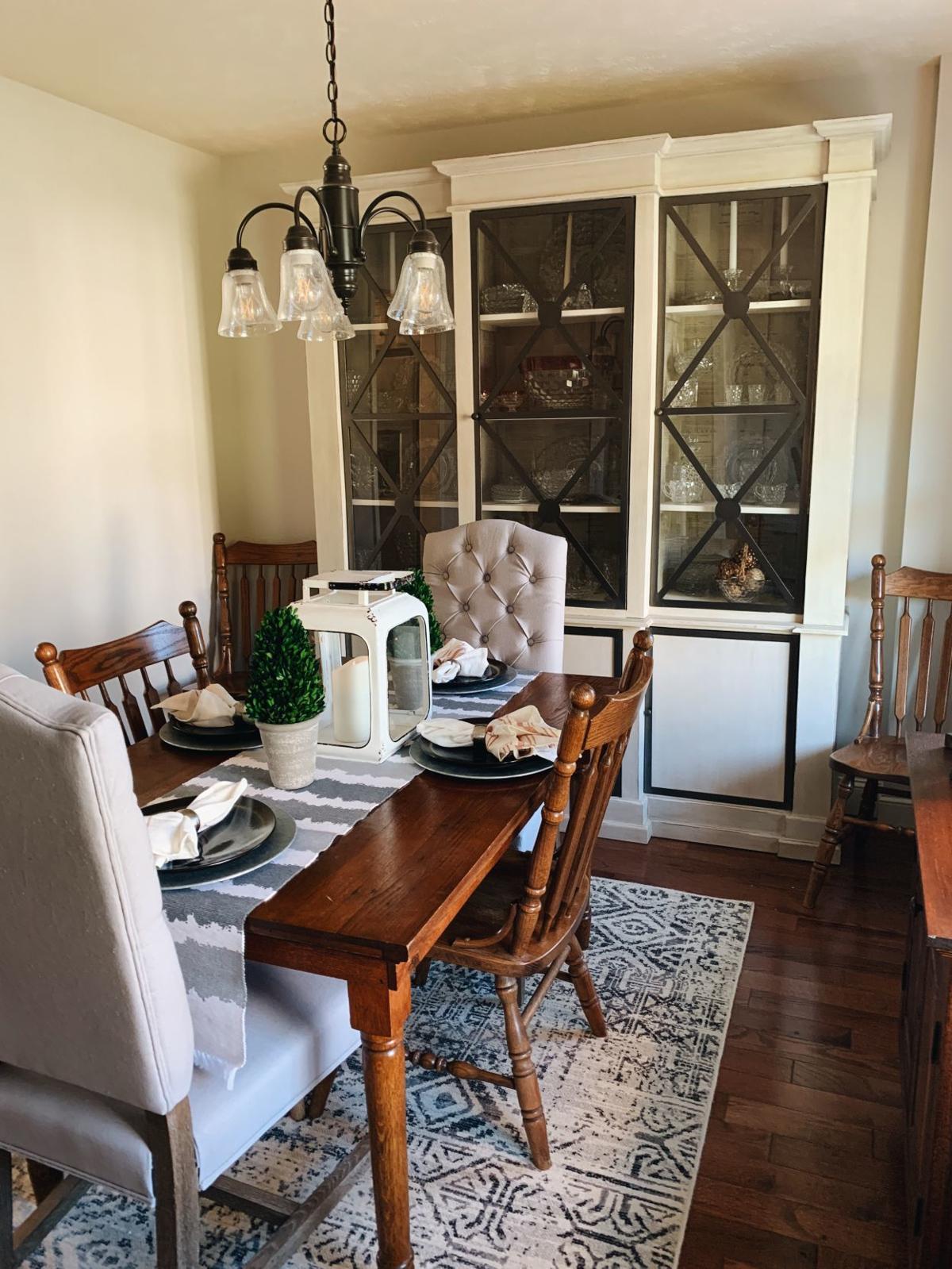
The off-white painted finish brought even more softness to the design and made for a perfect statement piece for the back wall of the room. The interior of the cabinet was especially unique due to the inside being lined with old newspaper prints that created an interesting backdrop for all the glassware to be displayed against.
Rose’s office was a such a fun and easy room to create. Her personality is effervescent, and we wanted her work space to reflect that quality as well.
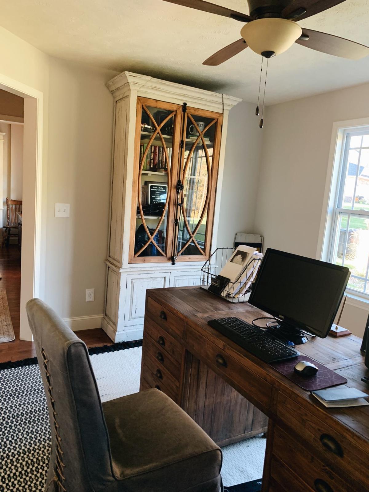
We chose a pine desk with ample storage to float in the center of the room on top of a black-and-cream, hand-knotted Magnolia Home area rug. A large abstract art piece filled one entire wall. While neutral in color with whites, grays and creams, it also created a “wow” factor with its large gold foil accents.
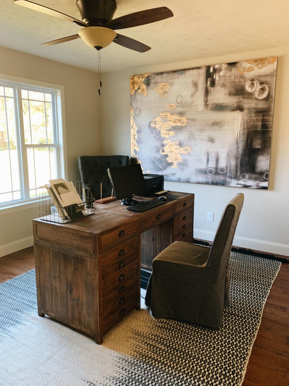
A comfortable tufted guest seat was placed in the corner next to an acrylic, white painted tree stump that would be used not only as an interesting accent, but a place for guests to set a drink or cozy up for a conversation. Like the dining room, we chose to install a large wood and glass painted cabinet that would easily store all of Rose’s medical books, journals and the awards she has accumulated throughout her medical career.
It is always a challenge and a pleasure to work with clients who would like to include antiques and meaningful furniture into their new homes and designs. We loved getting to work with these smart, funny and talented women, and we hope you enjoyed an inside look into the entry areas of their home.
Elizabeth Yeager Cross is the owner of Yeager Design & Interiors in Scott Depot. You can follow YDI on Facebook, and Yeager Cross can be reached at 304-760-8914 or by email at Yeager@ydiwv.com.

