Happy New Year! What better way to start off the year than with an “Out with the old, in with the new” remodel?
Last month, we at Yeager Design & Interiors shared an extensive kitchen renovation for our client, Jim Thomas. Today, we would like to show off his master bath. It is always key to include a to-do list when planning a renovation. A list of must-haves and must-gos can be the key to keeping you on track and making sure all areas receive the attention they deserve.
Here was our list:
Must go:
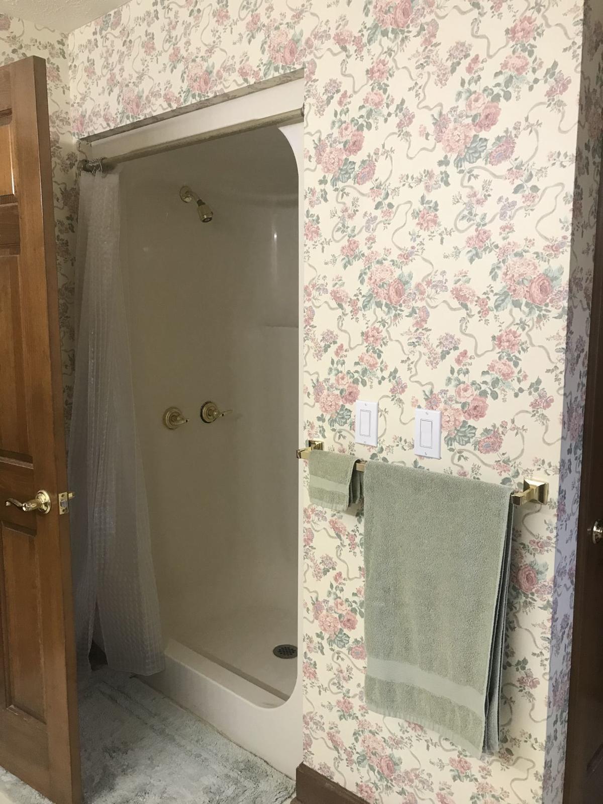
- pink and teal wallpaper/color scheme
- shower enclosure insert
- dated tub surround
Must have:
- updated color scheme
- large open shower with jets
- personalized vanity storage
While working with Jim, the common theme throughout his home was floral wallpaper in hues of pinks, greens and teals. The master bathroom was no different. In fact, it was even more challenging. Every square foot of wall space was covered in dated wallpaper — and what wasn’t wallpapered was covered in worn-out tile.
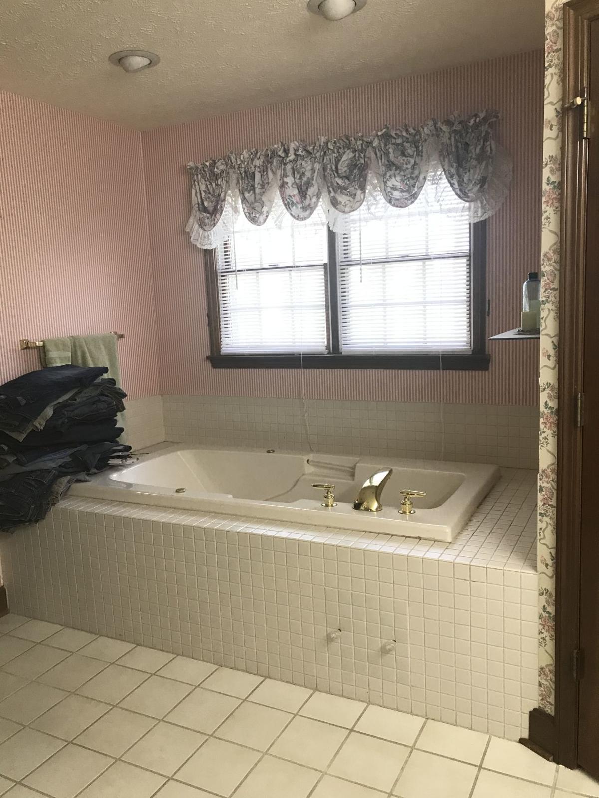
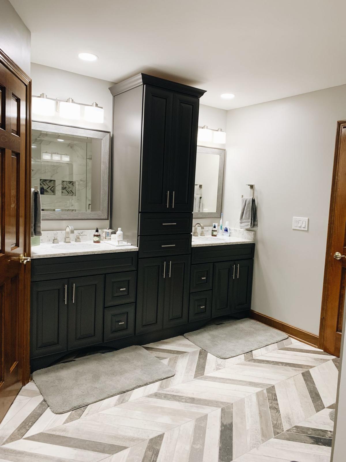
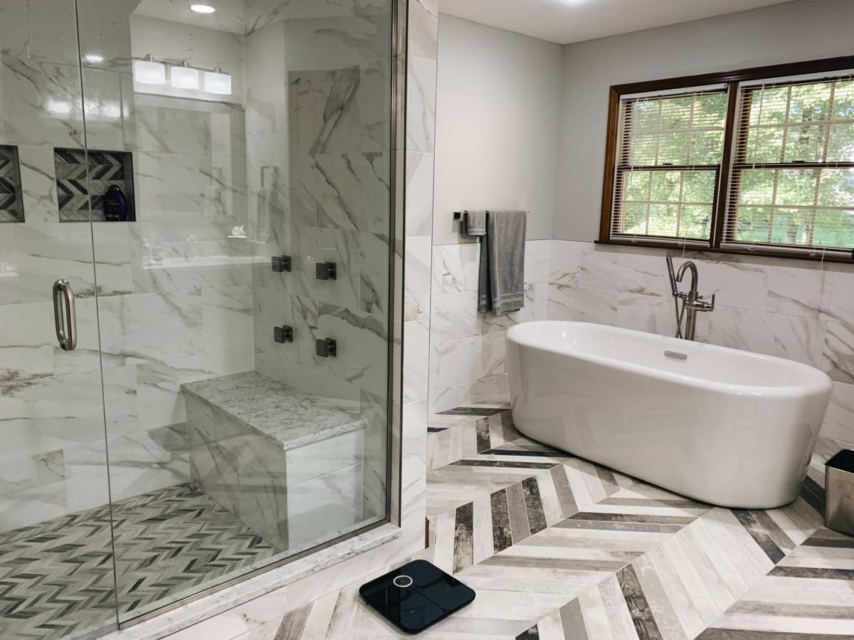
Our first goal was to remove these aesthetic obstacles as soon as possible. While Jim — like many of our clients these days — loved the newer gray tones, he wanted something different and more rustic than an all white and gray room. We chose a misty gray wall color to pair with white marble porcelain wall tile in the tub surround area and shower walls.
This particular marble pattern was called “calacatta gold” and featured more in-depth colors than just gray, including taupes and even some spots of gold tones.
But the real showstopper was the main floor and shower floor tile. We chose a chevron installation of rustic wood-like tile called “progressive timber frost.” It set the tone for a unique and eye-catching design.
When we tore out the shower enclosure, we also chose to tear out a small linen closet beside of it. It was more of a catch-all instead of an organized storage solution, and we vowed to make room for these items in our custom vanity. This gave us room for an expansive shower that was Jim’s No. 1 priority.
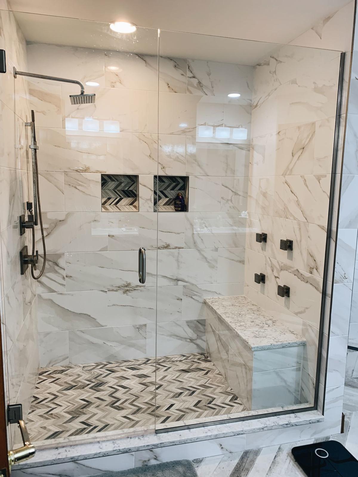
He knew from the get-go that he wanted a jetted shower as well as a large shower head and handheld system. Our contracting team expertly installed every bit of the plumbing to make sure Jim’s wishes were carried out. To finish the installation, we used a clear glass panel and door system that beautifully shows off the intricate tile installation and design.
To replace the large and unused tub surround area, we specified a beautiful, white stand-alone soaker tub. The simplicity of a tub without built-in tile surrounds can truly transform a bathing area. The calacatta tile backdrop creates an ethereal and peaceful experience that is sure to relax any end user.
Jim’s vanity area, while vast, was not a custom installation for him or his needs. We designed a double vanity with adequate storage for every day needs, as well as a linen cabinet to separate the spaces placed in the middle. This area would house all the items from the linen closet we removed for the shower design.
To balance the light color scheme of the room, we chose a medium to darker gray finish for the cabinets called “Earl Gray.” This paired with the Everest quartz countertops made for a handsome custom installation. We finished the look of the vanities out with unique mirrors over each sink that pulled the rustic barnwood look up to the walls.
This bathroom came together in a rustic yet modern design that is exactly what our client was looking for. Just recently, Jim told us he loves coming home every day and seeing his transformed home. What used to overwhelm him with out-of-date finishes now makes him feel relaxed and at ease.
As always YDI could not make installations like this happen without our talented installers, Rapid Contracting Group and local sources for materials and finishes. We hope this inspires you to make some lists of your own for the New Year of must-haves and must-gos.

