By Elizabeth Yeager Cross
WV Design Team
Kayla and Dennis Hannah, who live in Ona, are the latest examples of a Yeager Design & Interiors before-and-after project. Today, we’re featuring their kitchen and eat-in dining area, which we are ecstatic about.
The main considerations for this area were:
Realistic budget (due to working on multiple areas of the house at one time).
Upgrading finishes and making the cabinet and appliance layout more efficient for their use.
Lightening and brightening the space.
BEFORE: A pub-height table and chairs used to work for Kayla and Dennis Hannah, but with two young children in the house, it wasn’t a great fit for them anymore. And the dark, slick finish of the old table showed every hand print, every crumb and every spill.
When the Hannahs’ first approached YDI, they had a very long list of wants for their home-improvement plan. They had suffered a bad experience with a previous contractor that left them with a unusable master bathroom for more than a year. We’ll feature their master suite remodel in a future article, so stay tuned.
Among the many other items on their list, the kitchen and eat-in areas were a small-scale budget want. We knew we had to address multiple factors in this space but not on a total-gut renovation type of budget.
Realistically the best thing to do was to save the majority of their cabinets and paint them using Chalk Paint by Annie Sloan in Pure White. This would leave us more funds to update appliances and other finishes in this space.
BEFORE: An inefficient layout with standard-grade finishes and appliances just wasn’t working for the Hannah family, but they wanted to upgrade the space without breaking the bank.
While we were planning to use 98 percent of the cabinets, we desperately needed to get the refrigerator out of the kitchen corner and away from a wall. The previous placement of the appliance left it hard to open, difficult to clean out shelving and generally inefficient in its use.
There was also a long wall adjoining the kitchen that was completely unused in the original kitchen plan of the home.
We designed a new plan to bring the refrigerator out of the corner and against that wall, and to add a pantry cabinet to the side, as well. This simple move increased storage, ease of use and functionality in the entire kitchen.
To fill the void where the refrigerator had been, we ordered unfinished oak cabinetry in a similar door style because we knew our end goal was to paint the entire kitchen, and it would all end up matching in the end.
Kayla Hannah hired a painting team that came in and transformed their once orange-y oak cabinets to a beautiful, clean, pure white that would leave the space looking updated, transitional and simplified.
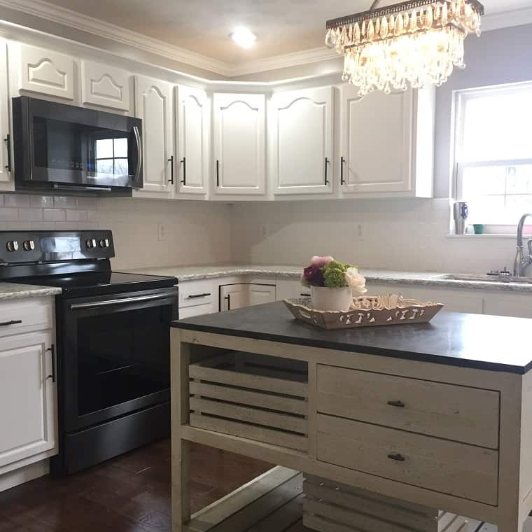
To accompany this new gorgeous look, we replaced their Formica countertops with a simple gray-and-white quartz countertop, ice white subway-tile backsplash and brand new black stainless steel appliances and fixtures.
We chose black rod iron cabinetry hardware to add to the cabinet design, where previously there was no hardware. Using no hardware on kitchen cabinets increases the wear and tear exponentially due to the hand-to-door contact ratio.
We also added a custom island to the middle of the kitchen. It filled a large void that had previously resembled a dance floor in the middle of their kitchen. This new island not only provided storage, but also an additional workspace for the Hannahs to prep and present meals.
We chose a teardrop, beaded pendant light over the island that would brighten the space and give an extra bit of charm to the new design.
The eat-in area of the kitchen had previously housed a pub-height table in a dark wood finish that had definitely seen better days. While raising babies, furniture never seems to last very long.
Taking the family’s needs into consideration, YDI suggested a new table in standard table height for ease of the children climbing into and out of the seats, a semi-rustic wood top finish paired with wood and metal chairs.
These new finishes would be easy to clean and much harder to destroy. We also added a simple yet beautiful crystal orb pendant that would tie the look of the kitchen’s elegance together seamlessly.
AFTER: The solution was to paint the cabinets with Chalk Paint by Annie Sloan in Pure White; adjust the cabinet plan, but reuse 98 percent of the original cabinets; and add a new countertop, new backsplash, new appliances and a new island with a show-stopper light above it.
The transformation of the Hannahs’ kitchen and eat-in area took our breath away. They were extremely pleased with the end results and said over and over again how much easier this experience was working with a designer who project-managed the construction crew and all coordinating installations.
As always, our work with contractor Tony Harrah was nothing short of fantastic. His attention to detail in crown molding, tying the different types of cabinets together and tile installation made all the difference for the project.
If you find yourself in a similar position for renovation, take a note from the Hannahs. You can find a designer who will coordinate your job for you while keeping your budget — as well as your wish list — in mind.
Keep a lookout for more of the Hannah home in YDI’s future design articles.
– To see more pictures of the project featured in this article: Hannah Home
– To read the full article: http://www.wvgazettemail.com/life-home
