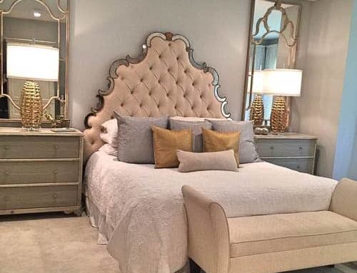
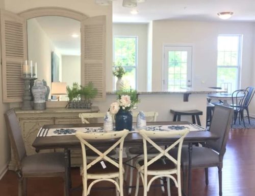
Over the past couple of months, we have been fortunate enough to work on some truly beautiful transformations with genuinely beautiful clients. And as every interior designer knows, pictures of the finished spaces are our crowning glory.
Even more important are the before photos that help show the journey of the design process. Quite often, we get so excited to begin the installations that the uber-important before photos are forgotten and are usually remembered at the finishing point!
We would like to share with you some of our before and afters that we were fortunate enough to grab that illustrate the importance of finishing touches and the warmth they bring to our spaces.
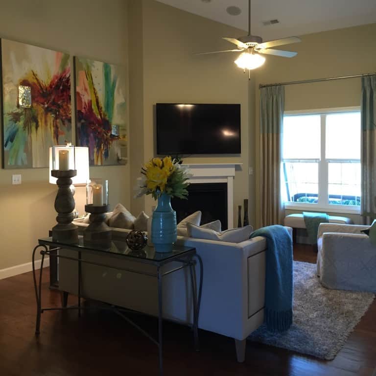
Our first before and after is the Watts Home. This townhouse was an architectural dream for smaller spaces. Tall ceilings, an open floor plan, large windows, and clean white finishes set the tone for a fresh design scape. The client had been a Pottery Barn aficionado in past years and was tired of her red, green and yellow color scheme. She was ready to lighten things up and introduce hues of blue and punches of color with a neutral linen base.
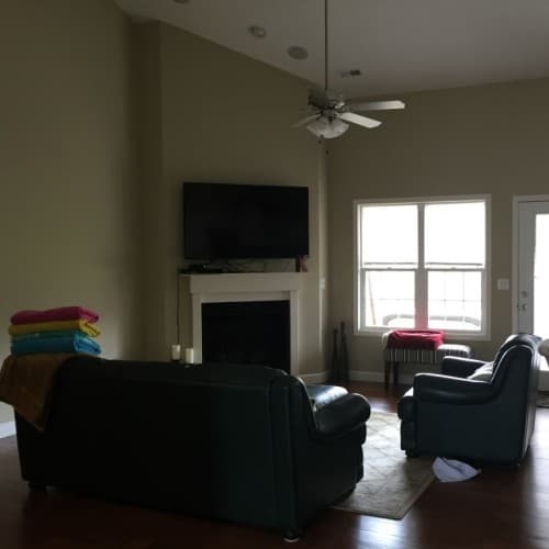
Before
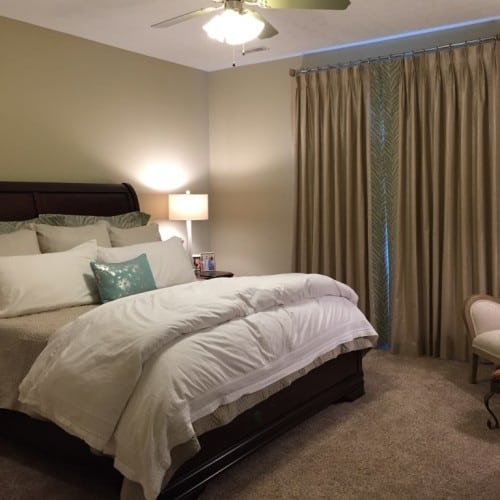
We were able to create warmth in the layers of accessories, art, and window treatments in both the living room and bedroom by using splashes of color with the neutral palette of upholstered furniture and hard finishes such as cabinetry. The living room touts aqua and teal with touches of reds and yellows to make the space feel vibrant while the bedroom stays more serene with just a small hint of the teal and aqua.
To replace the green leather furniture set she had grown weary of, we incorporated a classic tufted linen sofa with feminine lines, decorative nailheads and gorgeous toss pillows. A slipcovered swivel glider chair paired with a tall wingback set against a sleek leather ottoman created a conversational setting that no longer overwhelmed the open space.
After choosing the perfect artwork and rug to bring contemporary pops of color, we chose to incorporate a gorgeous waxed linen window treatment with the top two feet trimmed in Greek Key fabric in shades of aqua and turquoise. Finishing touches of ceramics, exotic florals, throws, and candle light warmed up the space and made the new townhouse a home.
She also chose to bring the aqua and turquoise into her bedroom. To keep her window treatments subtle and romantic, we chose to use the same waxed linen from the living and dining spaces but made it different and special by using an exotic animal print in the same aqua color to trim the panels. Custom Euro shams made in the same animal print brought a touch of glamour and color to the luxurious new embroidered bedding.
Our next featured before and after is the Devlin Home. The eating area and formal living room, while open, were separated by architectural stacked stone columns. The back wall of the home featured two sets of large windows that presented odd angles for draperies. By tying in the paint color in the smallest accent of the fabric in the draperies, a connection was formed in the eating area, and the entire space was warmed and highlighted by simple decorative panels.
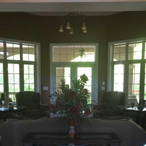
Before
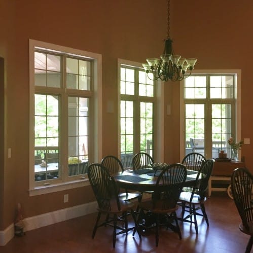
An easy way to give warmth to a space with very tall ceilings is by dressing your windows. Window treatments with complementary colors to your paint scheme helps not to draw your attention to only the window treatments, but to see the space as a whole. By mounting the rods at a few feet above the top of the window trim, it draws the eye up while creating a visually appealing stopping point.
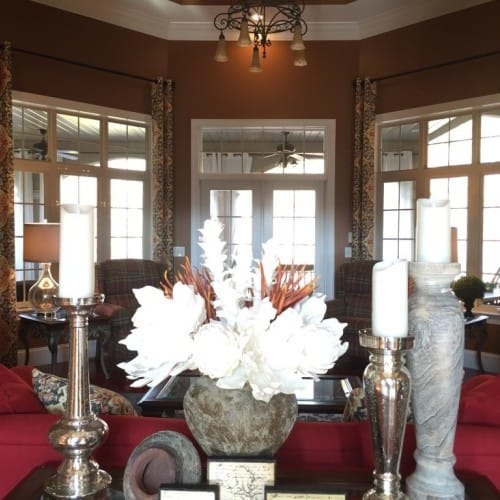
After
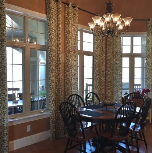
We chose to use half-sized panels in order to complement the angles of the walls instead of overwhelming the corners with an abundance of fabric. Black wrought iron rods were hung at 11 feet high to make a connection with the tall ceilings. The living area was transformed by a custom-designed red sofa, separating entry hall sofa table accents, and tying it all together with coordinating window treatments in a bold charcoal, red and gold pattern.
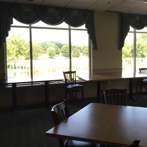
Our last before and after comes with a bit of a twist. Yeager Design & Interiors not only designs for residential spaces but also commercial spaces. After a recent remodel on the main dining room at Sleepy Hollow Country Club, the once formal dining room with dark green carpet was updated to laminate wood flooring and painted an off-white color.
Before
In this commercial space, the window treatments were serving as both functional and aesthetic elements of design. The large amounts of fabric in between each picture window allows for sound absorption and frames out the view nicely without obstructing the view of the beautiful golf course from the dining room.
After
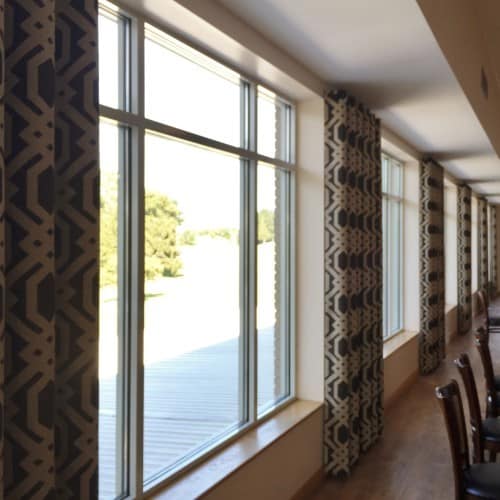
Because the space was so vast and now had no soft surfaces to absorb sound, the acoustic issue that was created became a large problem for dining and events. The swagged teal window toppers from the early 1990s were left in place after the remodel and didn’t quite fit the new direction for the golf club. To accomplish our goals of adding acoustic and design properties, we installed custom panels with an Imperial Trellis design that encompassed the entire back wall of the dining room.
Hung at the highest height available, we chose not to use cumbersome traversing rods across the tops of the windows but rather used short rods to hold the fabric in place over the drywall portions of the back wall. This allowed us to cover as much wall space as possible to help with the acoustics problem while still providing an unobstructed, dramatic view of the golf course upon entering the dining room.
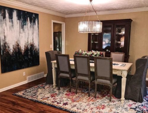
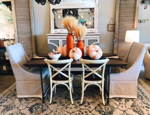
Finishing touches can be anything that fills your space and makes it feel complete. From window treatments that serve multiple purposes to beautiful decorative accents such as florals, throws, and updated upholstery, your home or work space can be easily transformed with the help of a designer.
And to document your journey, be sure to remind us to get those ever important before pictures before it’s too late!
– To see more pictures of the projects featured in this article: Watts Home
– To read the full article: http://www.wvgazettemail.com/article

