By Elizabeth Yeager Cross
WV Design Team
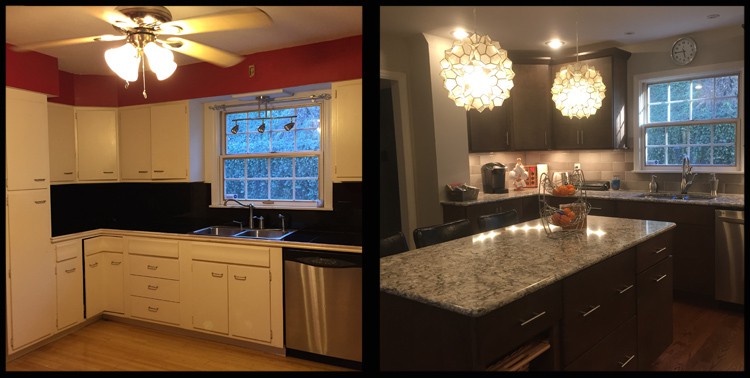
TOP: The new design included a fully functional pantry and a place for wine storage. BOTTOM: A boot bench allows easy access from the garage with an organizational structure designed to ease clutter.
Yeager Design and Interiors has seen its fair share of kitchen remodels over the years, but we are more than excited to share our latest full-scale remodel with you.
The Famularcanos are a young, vibrant family who live in Charleston, and came to YDI for advice on how to update their kitchen and the first floor of their home.
The kitchen was a cramped, square space filled with old cabinets that had many visible coats of paint from years of wear, tear and repair. The countertops had tiled black squares with a worn white wooden trim that was badly in need of replacement. The existing flooring was a bamboo plank that had cupped and pulled away through the years and did not match any of the other existing first-floor hardwoods.
After measuring the kitchen, my first thought was to look at the adjoining dining room. Although the wall that separated the spaces was load bearing, it seemed clear that removing the wall would be the best solution to join the two rooms and gain the maximum potential for the new kitchen plan.
The list of needs for the new plan included:
• A new layout for appliances and cabinetry.
• A full scale pantry.
• An island that would provide storage as well as seating.
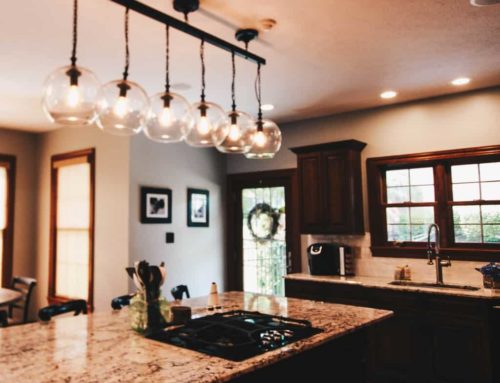
• A new lighting plan for the island pendants, a larger pendant over the eating table and a general layout for recessed can lighting.
• A boot bench to accommodate entry to and from the garage.
• Adequate room for a kitchen table to seat six people comfortably.
After determining that the wall could come down by placing a support beam in the ceiling, we gained an extra 11 feet in length, giving us a kitchen plan of 23.5-feet-long-by-14-feet-wide.
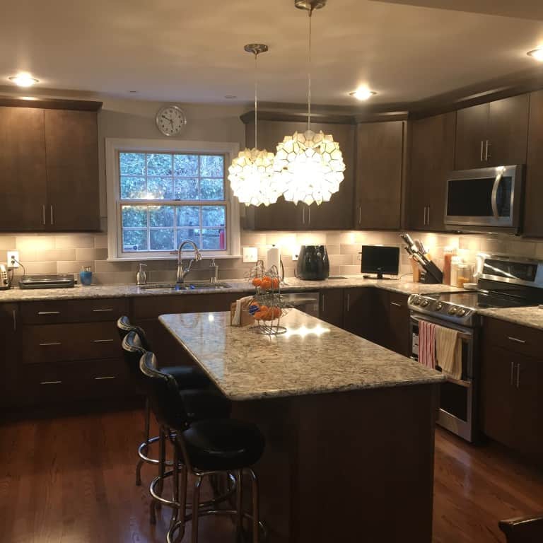
For their cabinetry, the Famularcanos chose an elegant dark finish on a contemporary flat-panel-designed door with stainless steel hardware. The countertops were a mixture of Cambria quartz Bellingham for the perimeter and island tops with Absolute Black granite for the boot bench and bar top. They also opted to purchase new matching stainless steel appliances to update their new plan.
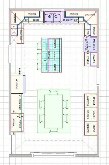
The new floor plan is 11 feet bigger than the old one, and can accommodate six people around the table for dinner.
As for the new design, we met several times to discuss placement and ended up with a stellar plan that met all of the criteria on their list, while bringing new life and color into their space. But as anyone who has ever endured a remodel knows, surprises can be behind any corner (or pantry, for that matter).
On the first day of the install we were met with our first design challenge: there was a hidden HVAC unit and duct work built behind the existing pantry and broom closet. This absolutely threw us a curve ball and caused us to have to rethink the corner to the left of the sink. We decided to work around the ducting by dry walling the area and ordering a few new, less-deep cabinets to accommodate the bump.
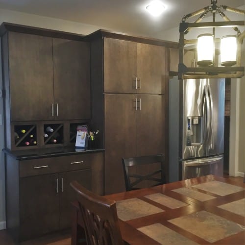
The new design included a fully functional pantry and a place for wine storage.
We moved the cabinets originally intended for the space to the far end of the new pantry and refrigerator area. We added three small wine cubes under the wall cabinet and made a small bar that in the end, the Famularcanos loved even more than the original plan.
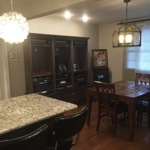
A boot bench allows easy access from the garage with an organizational structure designed to ease clutter.
As for the floors, we chose European Flooring to come in with new, unfinished wood and patch-in planks that matched the original hardwood of the dining room. They sanded all of the floors and stained the surfaces to create a seamless new look that made the flooring look absolutely stunning and fresh.
A sleek line backsplash was chosen to complement the gray wall color and bring out the bits of gray in the beautiful countertops.
All of the planning and design work would have been pointless, though, without a tremendous contractor. We worked with Anthony Harrah Contracting and never had a single issue we could not work through with ease. Their craftsmanship made for a turn-key job that literally took our breath away.
If you are in need of a kitchen remodel, the most important things to keep in mind are:
• Determine a realistic budget.
• Rely on a designer and contractor who have a history and work well together.
• Repeat the mantra “kitchen remodels are hell and this too shall end.”
• Be prepared to be inconvenienced for at least six to eight weeks.
• Be ready to make more decisions on the front end and put trust in your design and install team during the remodel. They will take care of you and have your best interest at heart (or else how would they get referrals).
– To see more pictures of the projects featured in this article: Famularcano Kithen
– To read the full article: http://www.wvgazettemail.com/life

