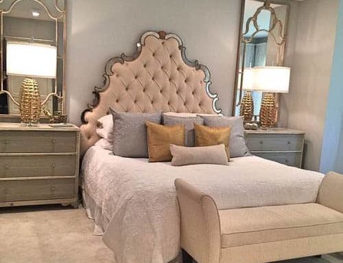
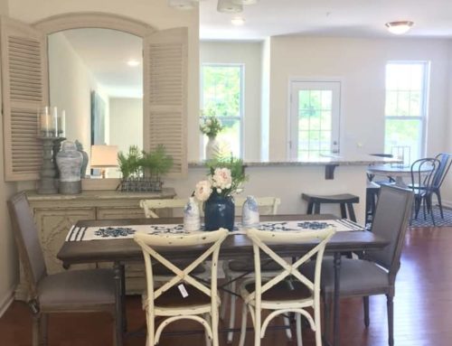
One of the most important, yet sometimes overlooked, elements of design is scale. This little word can make a big difference in whether a design is successful or not.
When considering everything from furniture to rugs, lighting and even art and accessories, one must be careful to consider not only the scale of these items but the space they will fill.
The pendulum of size can swing both ways, however. Choose selections too large for a space and you are left with an overcrowded and stuffed feel. Conversely, choosing items too small for a larger space can make your pieces feel minuscule and dinky.
Here are some things to consider when trying to find the right fit for your space and your purchases.
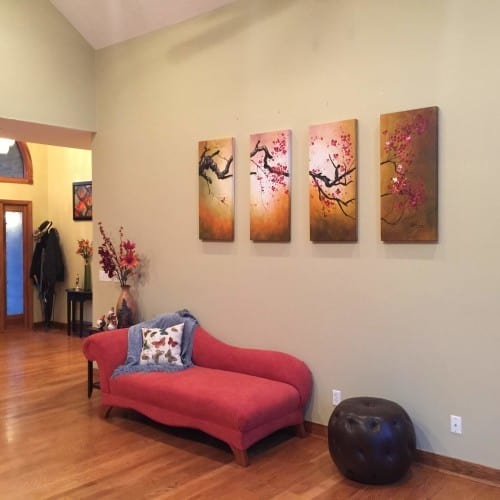
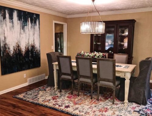
BEFORE
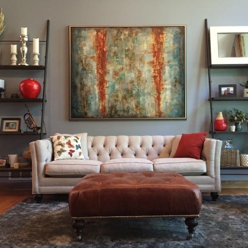
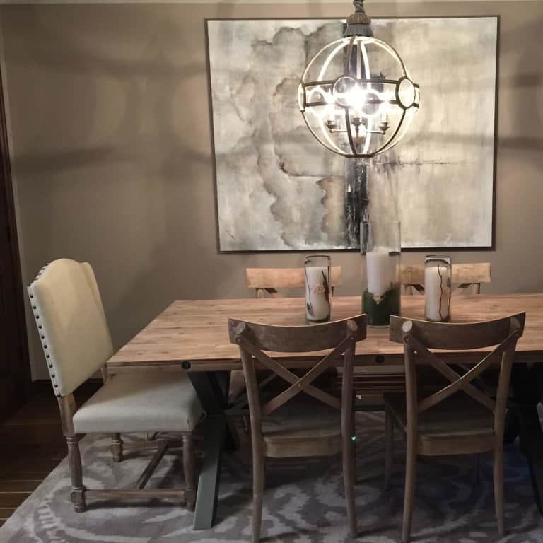
AFTER – the new furniture selections illustrate how important scale is to consider when choosing the items to create a successful design
Furniture
Whether upholstered, occasional or even case goods, all furniture needs to be selected while keeping the scale of the project in mind.
First, consider the space in which your items will go. Large spaces with high ceilings are often a challenge for people to find the perfect solution. If you have a room with 25-foot grand ceilings and a very open floor plan, you should consider larger pieces of furniture with considerable height to their frames.
This doesn’t mean you are limited to oversized and overstuffed pieces, but more to a mixture of pieces and sizes. Try pairing a larger-scale sofa with some medium-size occasional tables and accent chairs while mixing in some smaller footstools.
If you are working with a lower ceiling height of 8 feet and not such an open floor plan, the scale of your furniture should somewhat smaller. Lower heights of sofas and occasional pieces will work nicely not to overpower your space. Mixing these items with 8-foot or lower bookcases or shelves can create interest and address design on all levels for the eye to see.
Lighting
This is an area that I feel is most often done incorrectly. Somewhere along the interior design time line, small lamps were created — and, unfortunately, intended to be purchased in mass quantities and installed incorrectly.
I often find buffet-size lamps being used in spaces that call for much larger light sources. Lamps can be a dramatic design feature, and these days we have unlimited sources to choose from in all shapes, sizes and colors.
If you have an occasional table of 24 inches or wider, you have valuable space for a lamp with a larger base. If the table is smaller than 20 to 24 inches, be careful not to choose too large a lamp or it will overpower its placement.
If you have tall ceilings, consider using lamps of 30 inches or taller on your table.
Chandeliers are also often an incorrect size for their spaces. Grand foyers, dining rooms and even great rooms/living rooms are perfect for large light fixtures.
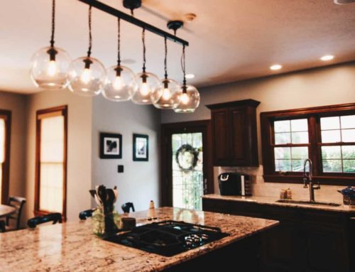
And just because you are looking to use a chandelier doesn’t necessarily mean it has to be dripping with crystals. Today’s lighting sources range in their finishes as much as their size. You can use multiple fixtures, ones crafted out of wood, iron, rope, glass, beads, etc. The possibilities are endless if you think outside of the “crystal” box.
Consider the width of your space as well as the height to find a fixture that fills the void in the space nicely and illuminates the area.
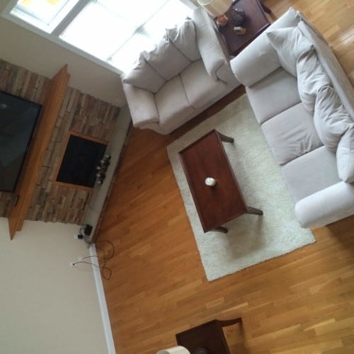
BEFORE
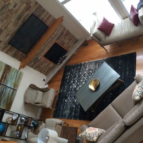
AFTER – the new selections illustrate how important using the appropriately sized rug to “kiss” the main pieces of furniture to create a sense of connection and warmth
Rugs
When using an area rug, it is often difficult to decide on the best size and scale for your space.
Let’s say you have nice hardwood floors in your living room and you don’t want to cover them up. Try sizing a rug that will “kiss” each piece of your furniture (meaning at least touch under one or two feet of the important pieces in the room) and still show off your beautifully finished floors.
Rugs can add warmth in their use as a layering tool that can add comfort, design and beauty. They can also be a great way to help absorb sound.
Rugs come in many standard sizes and can be made to custom fit your needs. Using a rug that is too small in a room is a design mistake that will leave your space feeling unfinished and choppy.
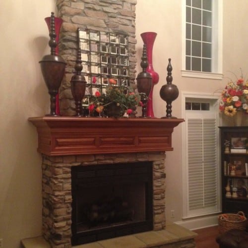
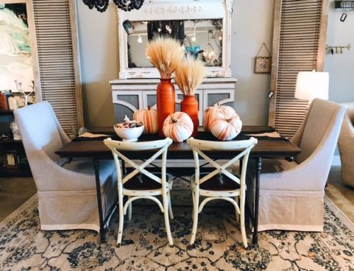
using large accessories in rooms with grand ceilings draws the eye up and creates a sense of connection from floor to ceiling
Art and accessories
This design aspect’s three most important issues regarding size and scale are:
1. Larger spaces deserve larger accessories and art.
2. Smaller spaces do not necessarily dictate using only small art and accessories.
3. Always scale your wall accessory to what is directly underneath or in front of it.
These three concepts are mostly self-explanatory, but to elaborate a little, scale is just as important here as in any other feature in your space.
For example: A room with a large ceiling height and even larger mantel space should be accessorized with pieces that pull the eye upward and create interest while doing so. Using accessories that are too small can diminish the architectural beauty in the original design.
In a smaller room with lower ceilings, don’t be afraid to use a large piece of art if you have the width to pull it off, even though you may not have abundant height.
Try to remember that when you are placing art or mirrors over a large buffet table or even a sofa, using one small piece on the wall overhead will leave the space looking awkward and unfinished. Groupings of art, mirrors or collections are an excellent way to fill a void in a space if you can’t find the perfect size for a single piece.
You also don’t want to use something too large over your piece of furniture because this will dwarf your foundation piece.
Scale can be a tricky design element to master. Using an interior designer as a sounding board or second pair of eyes, so to speak, can be a fun way to get an outside opinion of what you may need help with in pulling your room’s scale together. Forget what you’ve heard. Size matters!
– To see more pictures of the projects featured in this article: Thompson Home
– To read the full article: http://www.wvgazette.com/article

