By Elizabeth Yeager Cross
WV Design Team
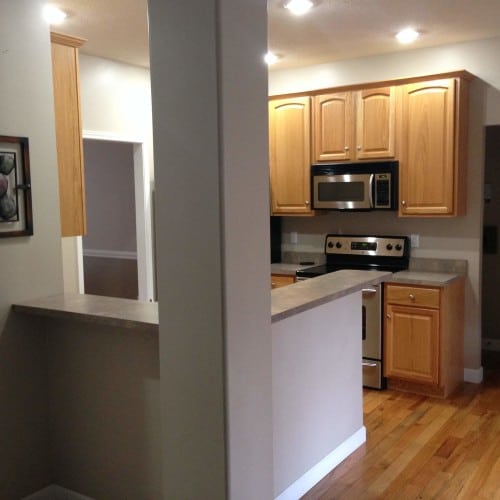
this family needed to expand their kitchen space to accommodate their family and their kitchen-based business
How often do you actually use your formal dining room? Once, maybe twice a year? Thanksgiving and Christmas if at all — right?
These days, when new homes are built, both here in West Virginia and across the nation, there is something missing: the formal dining room.
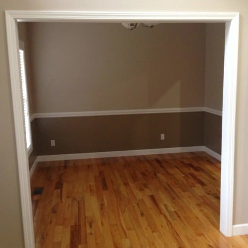
the formal dining room is closed off from other living areas of the home and often the best space to steal from for much-needed expansions in a family’s open living/dining plan
Eat-in kitchens that are open to the family room space are where we are headed when it comes to actually sitting down together and having a meal.
While this is easy to accomplish when building a new home, what do you do when your existing floor plan wasn’t designed this way?
Yeager Design & Interiors recently remodeled the home of a young family in Hurricane.
Kirk and Mandy Curry were unique clients, in that they both have normal jobs but have a fantastic side business called Healthy Kids Inc., which they operate out of their home.
There they film cooking shows and even bring in guest chefs that teach families how to prepare and cook delicious, quick and, most important, healthy meals for their children. They post these videos to their YouTube channel for all who subscribe to view.
With the success of their business, the need to remodel their space became apparent.
After a consultation with YDI and establishment of a budget, it was determined that the only way to grow their current kitchen was to expand into the existing formal dining room that was almost never used.
There were some design challenges to work around, however.
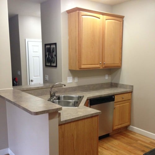
the original kitchen space was too small to accommodate their family and their kitchen-based business
The wall that separated the spaces was not load-bearing, meaning it could easily be removed completely. But the ceiling in the dining room was a different texture and pattern and would have run up the construction budget if both spaces needed the ceiling torn out.
Instead, we left a small header which was painted the same cool gray as the walls that all but disappeared when looking through the new design. We also had to install a downdraft for the new cook top since we were separating the range from the microwave/hood combo unit.
A vented ceiling hood was not an option since the floor above contained finished bedrooms and we were not using an exterior wall.
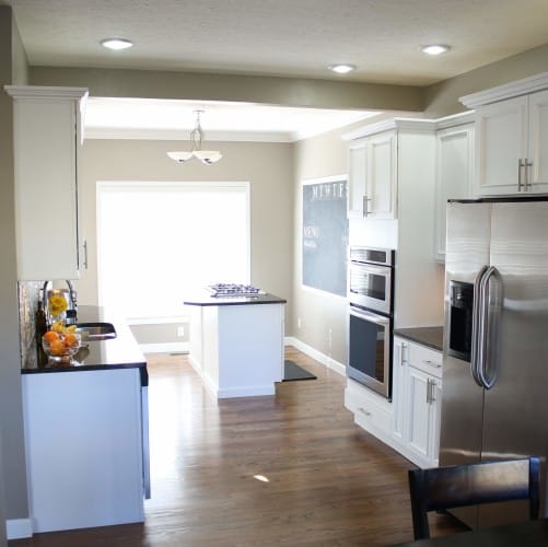
the final result: a new, open floor plan and an extra 144 square feet of space that wasn’t usable before
The main focus of the new space was to create an island that Mandy could easily cook and teach from and her husband, Kirk, could film her without obstructions.
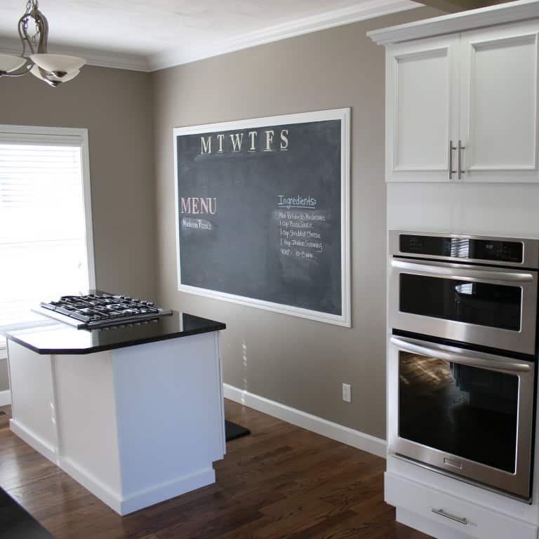
The new island includes a brand-new cook top, convenient spice rack pullouts, and a space for pots and pans she could quickly grab while filming. One of the unique additions to the new space is a large chalkboard that not only serves as a tool for their filming, but also doubles as a piece of art the whole family could use. Easy meal planning, drawings from the kids and sweet messages to one another quickly became a part of their day when they started using their new design.
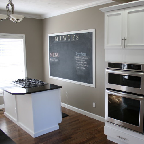
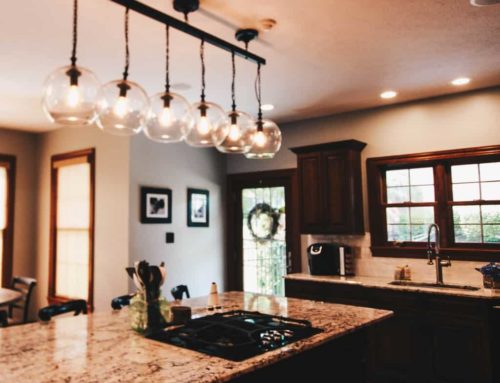
the new island includes a brand-new cook top, convenient spice rack pullouts and a space for pots and pans that Mandy can quickly grab while filming cooking videos
To achieve the new design layout and look, we used a clean white Mission-style cabinet with a straight line design that would not distract the viewer, contrasted with Uba Tuba granite.
A unique linear stone and glass blended backsplash was installed to create interest and a sense of fun and flair.
The original hardwood floors were sanded and stained a warm walnut finish that complemented the new contemporary gray wall color.
As shown in the before-and-after pictures, the entire first floor was enlarged and enriched by the new open floor plan.
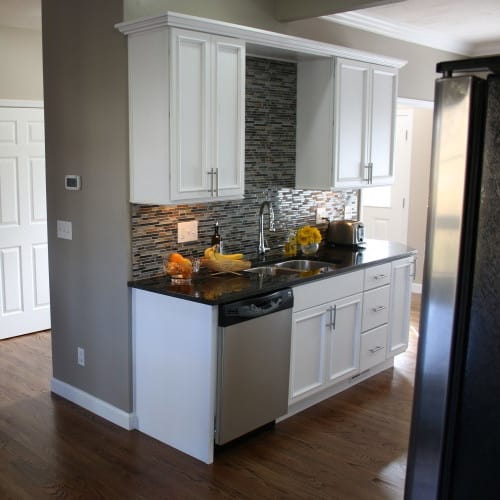
a unique linear stone and glass blended backsplash creates interest and a sense of fun and flair
Pulling the finishes from the new kitchen into the family room connects the spaces even more, and gives the impression of a seamless design.
Just because the Currys needed more space for their home business doesn’t mean they haven’t enjoyed it as a family as well. Gaining 144 square feet of usable space was a benefit they all shared.
If you find yourself thinking how little you use your formal dining space and how nice it would be to have more cabinet storage or counter-top square footage, don’t be intimidated. All it takes is a consult with a knowledgeable designer, a realistic budget and a trustworthy contractor and you just might not mourn the death of your formal dining room!
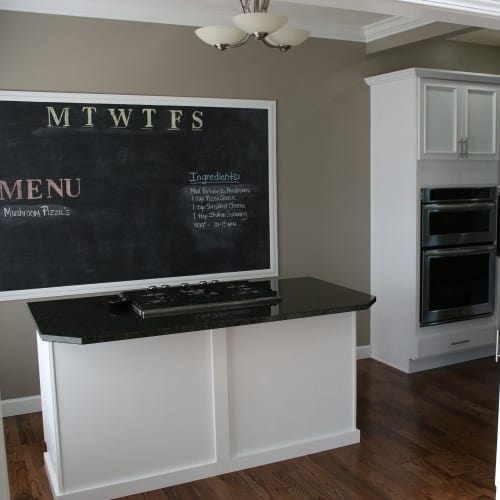
one of the unique additions to the new space is a large chalkboard, both a tool for filming and a piece of art that the whole family can use
– To see more pictures of the projects featured in this article: Curry Home
– See more at: http://www.wvgazette.com/article

