By Elizabeth Yeager Cross
WV Design Team
We’ve said it before, and we’ll say it again: a home is meant to be lived in. This can mean so many different things to different people, but I’d like to focus on one interpretation in general.
If you can walk through almost every room in your home and say to yourself, “We use this room almost every day and it serves its purpose,” then you deserve a gold medal in the Olympics of interior design.
As a designer, I consult with countless clients who sometimes do not use 75 to 90 percent of their homes and find themselves living only in one to three rooms of their house. What a waste.
I constantly ask my clients four questions:
1. Why do you not use this room?
2. What do you think would make you want to use it?
3. What activity or use are you missing a space for in your home?
4. Can we assign said missing space to these unused rooms?
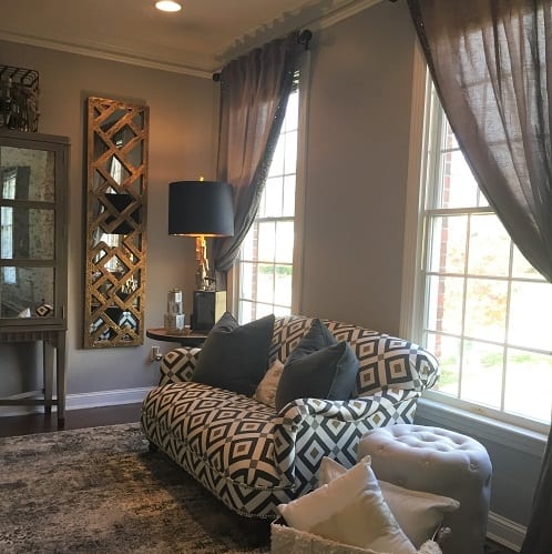
A warm and inviting color palette mixed with contemporary patterns and materials sets the new tone for the Layne’s home
Take my clients, the Laynes, for example. They are an absolutely beautiful family of three who are constantly on the go. Because they are so busy, they want nothing more than to come home and enjoy their surroundings and be at peace in their home.
This was not the case when we met a few years ago. Their initial consult was like many of my others: They welcomed me at their front door and kindly asked me to ignore their dining and formal living rooms to my left and right because they absolutely hated them.
I began asking my list of questions and discovering how to find the right solutions for them. They had gone years without using two pivotal spaces in their home for two main reasons:
1. They hated the things in them and the way they looked.
2. They just couldn’t figure out a way to repurpose the rooms and make them work.
Also, like many of my clients, they were only ready to do one room at a time, due to their busy schedules and desire to stick to a workable budget.
We determined the living room would be our first phase of transformation.
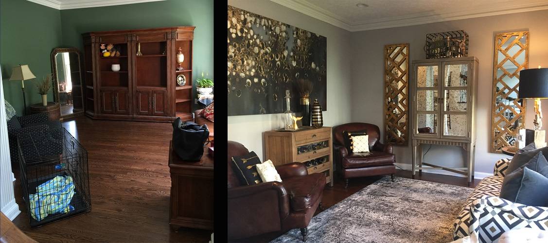
Don’t let formal front rooms become the catch-alls for forgotten or unwanted furniture. Instead, turn unused rooms into areas that family and guests will love
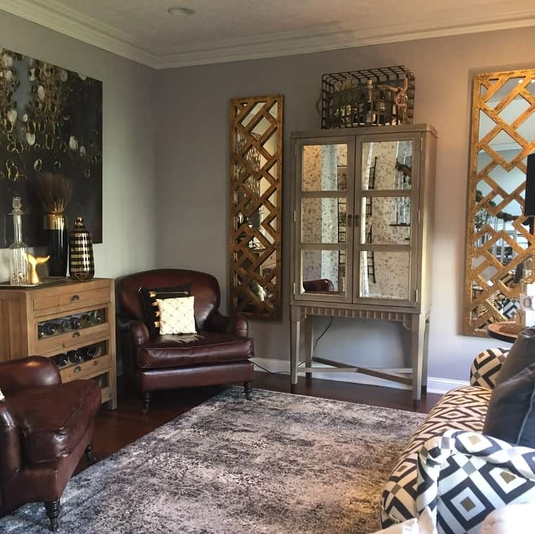
After much discussion, we came to the conclusion that the Laynes were missing a space to entertain their friends and family for after-dinner drinks and conversation. The smaller size of the room would be the perfect fit for a cozy and chic bar and sitting area.
To begin, we helped them find new homes for the existing furniture and started to make our list of furniture, finishes and fabrics that would become the new look for the space. Mr. Layne really wanted the room to be reminiscent of a transitional Cuban-esque style.
After visiting our showroom, they immediately fell in love with our buffalo leather club chairs in rich brown mahogany finish. These played beautifully against the new cool, gray wall color.
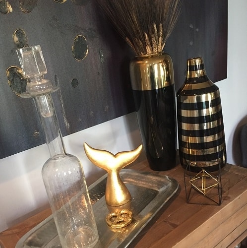
Personalize the accessories and add in “weirds” that can be both functional and conversation pieces like the gold pretzel in this set up that is also a bottle opener
They chose interesting vintage-themed pieces, such as the wine cabinet and end table that not only served as functional bottle storage, but also became a conversation piece.
We then chose a gorgeous mirrored bar cabinet that contained ample storage for everything bar related and didn’t take up a ton of room.
We chose a small scale settee and finished it in a contemporary geometric black, white and gold fabric accented with tiny gold nailheads.
A large, plush, black, gray and white area rug served as a soft and chic floor covering to tie the furniture pieces together.
After selecting our major furniture pieces, the Laynes left it up to our team to accessorize the room with accents that would bring in luxury and finish the space.
We chose an abstract, frameless canvas in black and gold, partnered with gold vertical mirrors to flank the bar cabinet. We absolutely loved the way the gold mirrors instantly brought an old-Hollywood feel to the new bar.
Charcoal velvet pillows were placed on the new settee to tie into the new gray window treatments embellished with matching sequins.
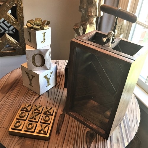
Create little moments of fun in entertaining spaces with accessories like this gold tic-tac-toe board
Metallic open-weave baskets were set in the room to hold extra throw blankets and pillows near the settee as well as on top of the bar cabinet to create height and interest to draw the eye upward.
Gold and black accents were also scattered throughout the room to bring the whole look together and become the finishing touches.
After the big reveal, the Laynes were absolutely floored with the transformation. Mr. Layne said he now loved the feeling he got when he entered his front door because he has an updated room that not only would be used, but felt warm, personal and finished.
In all my years of doing design work, there is no greater feeling than to see your clients thrilled with your work.
Interior design, to me, should be purposeful just as much as it should be aesthetically pleasing.
Our end goal for the Laynes is to make every room in their house serve a purpose and to be lived in. We continue to work with them on their home, one project at a time.
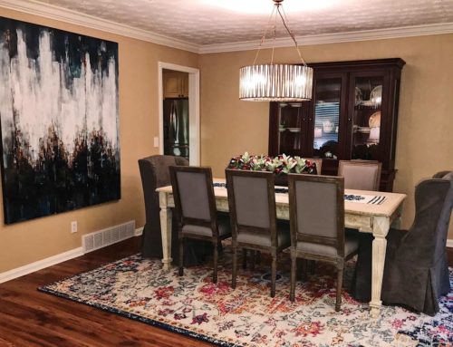
Stay tuned for our next article on their adjacent dining room transformation, which is under way as you read.
– To see more pictures of the projects featured in this article: Layne Home
– To read the full article: http://www.wvgazettemail.com/life-home

