By Elizabeth Yeager Cross
WV Design Team
A few weeks ago, we shared our first of three recent white kitchen transformations with you. The Kauffman kitchen drew so many comments and started a good bit of chatter about the simplicity and elegance in white kitchens, and we at Yeager Design are thrilled at your response.
Our second white kitchen feature family is Joe and Laura McCullough of Hurricane. Like all of our clients, Joe and Laura lead busy lives revolving around work, church, their children and their many activities.

The McCullough family was seriously lacking storage and workspace in their former dark and inefficient kitchen. Now they have space for multiple people to work in the kitchen at the same time, and it is much lighter and brighter.
The McCulloughs’ home was in definite need of updates and renovation work. Raising three children and multiple pets can quicken the wear and tear on a home. They felt their kitchen space no longer worked for them and was more of a doom-and-gloom look than the bright and cheerful one they dreamed of.
Our collective primary goals were:
– Lighten the dark color scheme.
– Make the existing floor plan as efficient as possible.
– Increase countertop square footage.
– Create room for an island for additional workspace.
– Create adequate pantry storage.
Working with the McCulloughs was an absolute dream. They knew what look they wanted and the budget in which they were willing to work, and they wanted all creative and design work to come from our team.
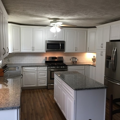
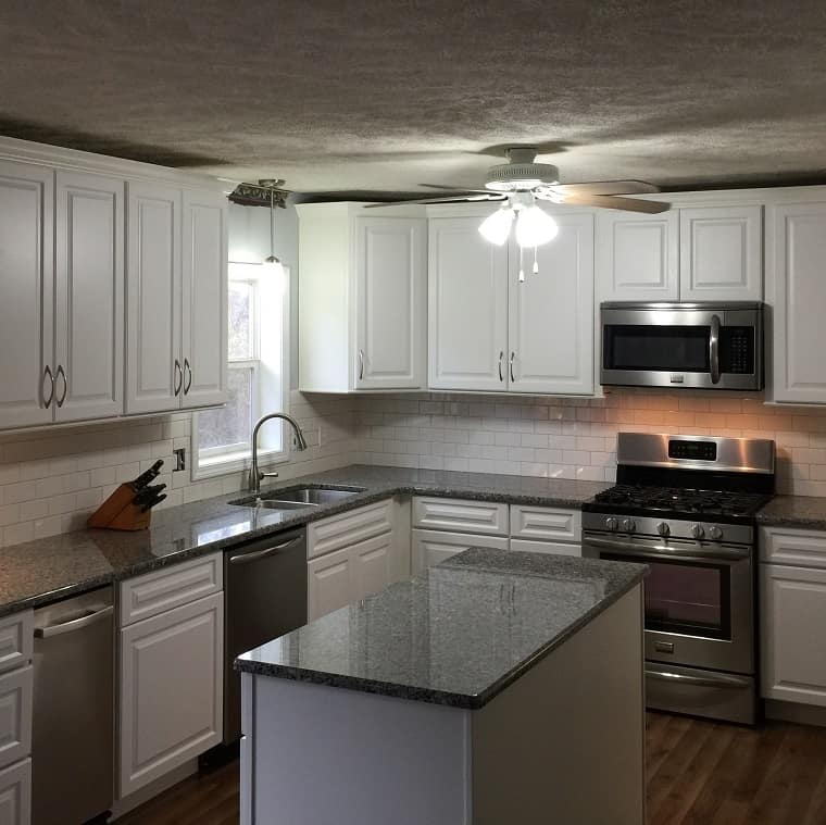
White cabinetry paired with white subway tile and neutral gray granite makes for a bright and updated kitchen that looks twice as large as before, with twice the amount of storage and countertop
During our in-home consultation we noted that even though the kitchen had French glass doors and a window over the sink, it truly was a dark space. Our first priority was to choose our finishes and change the dreariness to lightness. By selecting a palette of cool gray wall paint (replacing the current dark maroon color), white cabinets paired with white subway tile, and finishing with gray and white swirled granite countertops, we did just that.
Next, it was time to get down to the business of their new layout. For me, cabinetry and appliance configurations are like a puzzle I love to solve. As mentioned in the Kauffman’s design piece, I love to imagine the room as a blank slate most often.
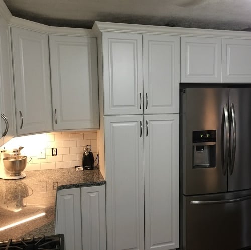
Relocating the refrigerator left room for more uninterrupted countertop workspace, and now all major food storage is located together on the right wall
To save a little money on the renovations, we will keep the sink in the same place, just as long as it is high functioning and works well with the new design.
Starting on the sink wall and working my way around the room, I then laid out all additional appliances and storage solutions. We chose to add cabinetry to the far back wall of the kitchen and relocate the range there as well.
By doing this, we not only added bountiful cabinetry storage and countertop square footage, but also got the stove away from the sink and dishwasher, creating two distinct workspaces for multiple person use and access.
We chose to clear all the existing cabinetry and small pantry closets from the right kitchen wall and start fresh there, as well. We let the corner cabinet be the transition to the run of cabinets that lead to the new refrigerator placement, followed by a brand new, built-in cabinetry pantry. This cabinet featured roll-out shelves from top to bottom, which would make it much more accessible to see and reach what the family was storing.
Finally, by removing the existing peninsula cabinetry, we paved the way for a large and beautiful island. While this island offers no additional seating, it is the perfect workspace for when Laura makes Christmas cookies and especially for when she is canning food.
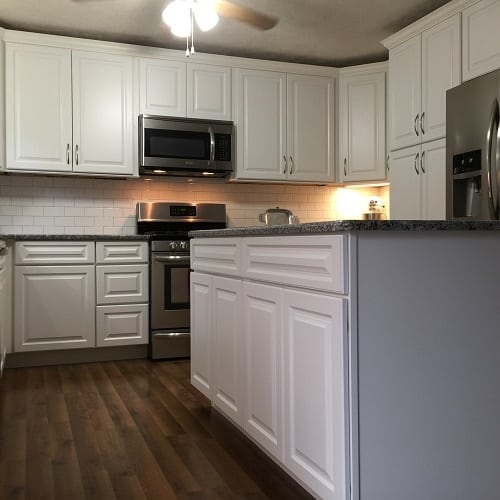
An island doesn’t always have to accommodate additional seating. In this case, the family needed a workspace where they could prep for dinner or set cookies out to cool
The result proved to be a bright and updated kitchen that looked twice as large as before with twice the amount of storage and countertop space.
Joe said he still couldn’t believe it was the same house, even a month after installation.
My main priority is to give my clients what they want, even if they aren’t sure exactly what that is. My job is to work the kinks and creases out of your design project, to let you know what is possible for your home and turn your dreams into realistic expectations.
No remodel, kitchen or bath, is ever without a few hiccups, especially when you have a pivotal spot in your home in total chaos for an extended period of time. Just know, in the end, you’ll have a freshly renovated design that will leave you feeling ready to use and love your new space.
Keep an eye out for our third installment of this white kitchen series, where we feature the Miller family in Charleston and their sparkling transition from dark and dreary to white and bright.
– To see more pictures of the projects featured in this article:McCullough Home
– To read the full article: http://www.wvgazettemail.com/life-home

